
Edison by T-Mobile is an enterprise application for businesses to be able to communicate internally both in the field and in the office. For T-Mobile business customers, this application will be the replacement for the desk phone and will consist of communication features such as calling, messaging, leaving voicemails, and creating contact groups for quickly reaching distribution lists.
The challenge
My main role on this project was to design the calling features at first. However, as the project continued, my role evolved to include a more holistic approach and I also had a hand in designing messaging, details, contacts, and settings alongside my teammates. One thing we were really focused on when designing the desktop leg of this application was the framework being easily accessible for multitasking. We wanted to create a system that could be broken down in several ways to account for people who would be involved in phone calls related to work but also might want to work within other windows and different apps or with different portions inside Edison itself. We knew we had more space to work with so we wanted to maximize this space while still allowing for a focused and non threatening experience. In addition to the challenges of multi tasking, we were designing based on systems already in place from the mobile experience so we had to keep it consistent while also making it a unique experience. We also had to worry about time constraints for shipping and versus all the things we had in mind conceptually.
My process
We spent the first few weeks doing a lot of conceptual work. This conceptual work included figuring out what the header would hold (or if we’d use a sidebar for organization purposes instead), how the blades would appear, where the settings would live, where the search bar would sit and other framework related challenges. When working with these concepts, we were also using research from competitive comparative analyses and keeping in mind the history of the mobile version. Other than the mobile experience for Edison, we looked at Slack, Microsoft Teams, Google Hangouts, WhatsApp, Skype for Business, and Facebook Messenger. While we were designing certain features, it was nice to be able to look at the ways other professionals had solved similar problems.

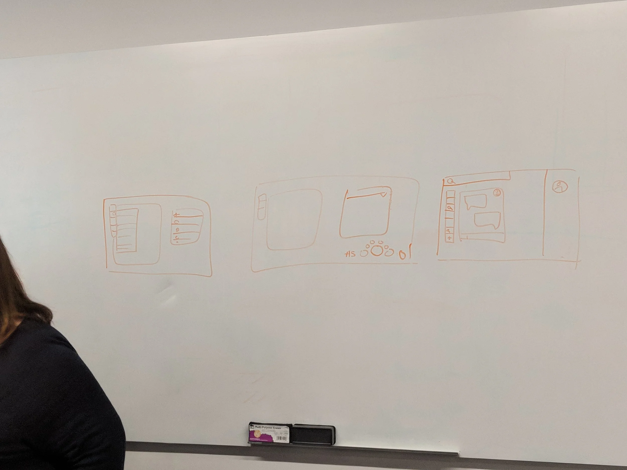
Wireframe of layout
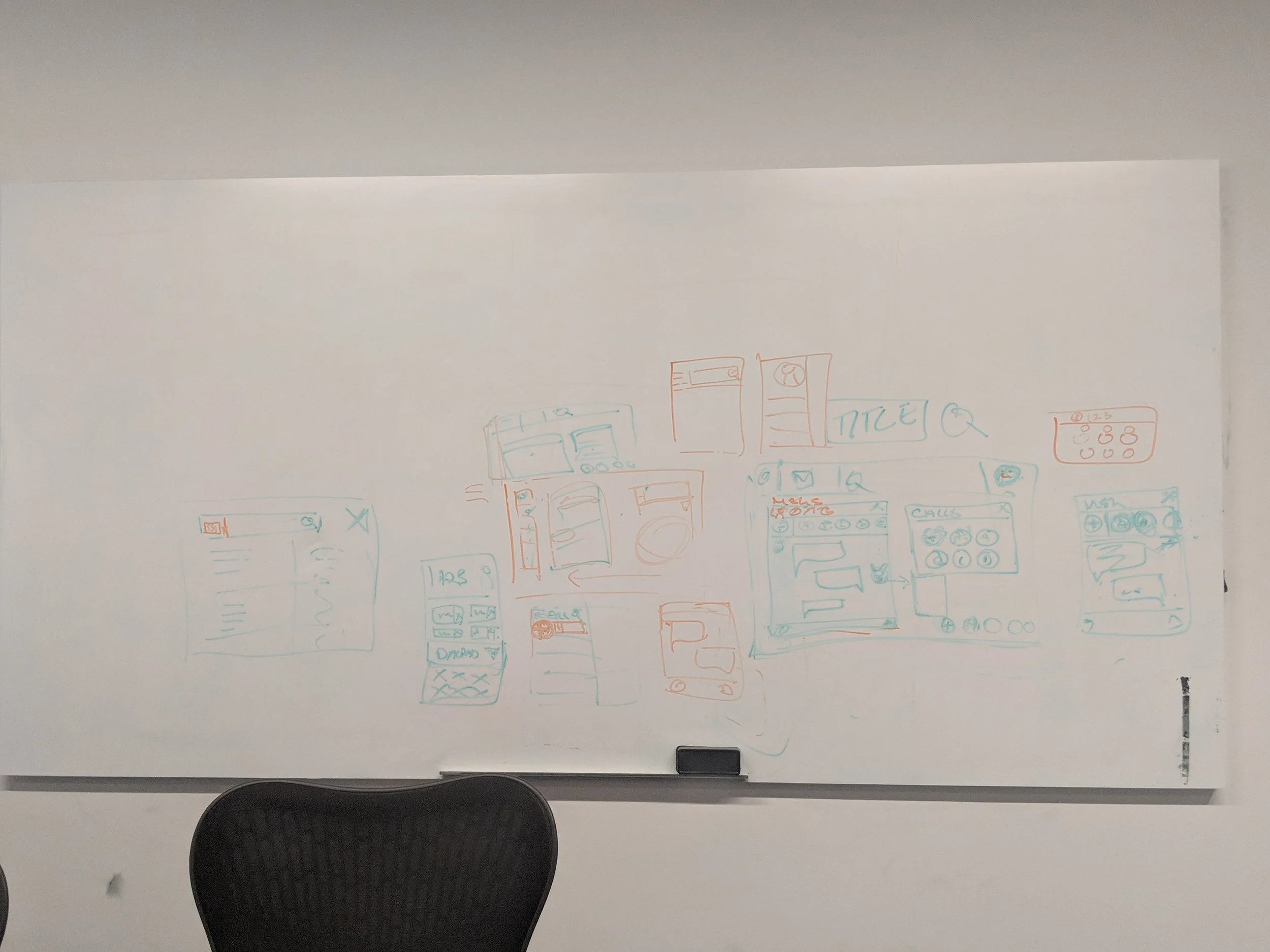
A couple more explorations of how we could use the space
Mockup showing what the app might look like on an actual desktopWe took the card idea and flattened it so that it was less of a Z-axis design and more of a framework that included pieces that slid in and out fluidly upon command. Using this inspiration and the multi-tasking ask, we came up with a system that would allow users to “pop” windows off the main window so that they could multitask in those windows while still focusing on whatever main task they had at the time. This was the main direction we wanted to go in when beginning to lock down the systems in the desktop application. Once we had this main idea down we could start filling out the other areas and the details.

First design systemOnce we had the framework ready to go I started designing calling. I took the general flows from the mobile experience and tweaked them for the desktop. There were many small differences that had to be taken into account. In order to make a multi-tasking friendly calling experience, every time a call was placed or received a new window was spawned for that call. From this separate window, all the calling actions would be made. When someone needed to view more details in this window, it would grow to accommodate an action that needed more focus, such as when a user wanted to view the contact details for the user they were on the phone call with. This went through many iterations until we whittled it down to an experience where the window expanded less and communicated with the main window more, allowing the user to use the calling window as a focus state and the main window as the area that most of the work actually happened.
The key here was that the popped out calling window communicated seamlessly with the main window and they worked together to create a tandem experience, only pulling in the other when needed. After finishing the calling experience here, I started lending more of a hand to the other sections of the application, such as the messaging and contacts. Because I had my hand in many of the places that the app worked on a high level, and I had worked on the framework, I was able to make pattern decisions that could interact with the different areas smoothly.


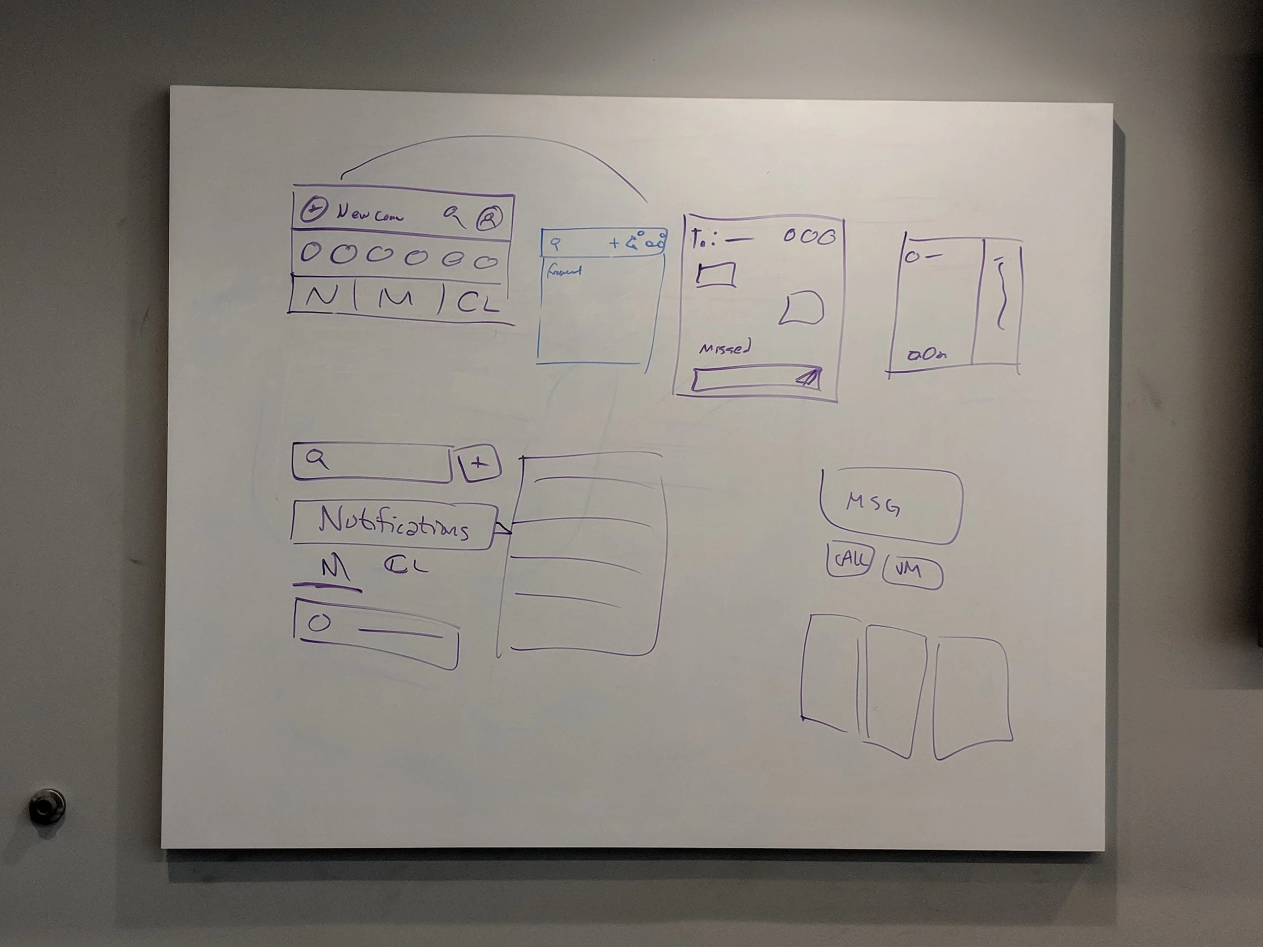
During this same version of the framework, I played with many different iterations of the how the buttons would be presented internally. I wanted to make sure that, like the rest of the desktop experience, they aligned with the mobile application so you can see cues taken from the mobile experience while also seeing small improvements based on how the web application was set up. These details also changed over time based on internal critiques, overall framework tweaks, and shifting acceptance criteria. Above you can see the different ways to start a message with the ongoing caller from the call.

Second design system
Second design system detailsTrouble struck when we were told that we didn’t have the ability to detach pieces of the windows out any more due to lack of dev bandwidth with the time allotted. For the most part, this just meant rethinking a couple decisions in the application but because calling relied on the surface being perpetually detached from the main window, I had to go back to the drawing board for every screen. This time, I needed to worry about how the multitasking would work in terms of a Z axis since it was implied that the active call would be an overlay on top of whatever was going on in the application. Once this was at a good place we passed it through all the channels to get it to development. We had passed it through these channels when we were given new news once again. This time the pivot was because it was decided that we would use the codebase from a previous app to create the current experience, in order to expedite the process.

Third design systemDue to a lack of developer bandwidth, and systems already being in place that were incorrect, I started to design a system that worked within the code that was already there for the most part, tweaking functionality that was incorrect and improving the overall look, feel, and flow. For this third system I drew from the experiences that I’d made in the second design since that’s what the third design was most similar to. The third design is the final system for the V1 release and while we are pretty far from where we started, my team and I have made the changes necessary to create an experience that users can intuitively navigate.