
NameID by T-Mobile is a product from T-Mobile that allows users to see and manage incoming phone calls based on the type of call. A user can see right away where the call is coming from and can manage their scam likely calls. In addition to providing the knowledge of where these calls are coming from, it allows users to sort call types by categories such as sales calls, robo calls, political calls, etc. As a user, I can decide to block callers from these types of categories or I can choose to whitelist calls from numbers that I trust. Say I don’t want to receive political calls so I block phone numbers within that designation however, I’d still like to receive calls from my governor, I can put that phone number on the whitelist to still receive their phone calls. In addition to the whitelist there is also a designation that allows users to send other people’s calls to voicemail so that they still receive a message. This application provides added value to people who want a more personal phone experience and who would like to be able to have more control over the way their calls are received.
The Challenge
When I was asked to work on this product I had just started my internship at T-Mobile. I was asked to start to think about how a user might want to be introduced to the app and to make a couple possible flows. I was also asked to think about what this flow’s UI might look like. While the rest of the application had already been designed and signed off on for the most part, there was still the missing element of the first run experience. While it may seem like an easy task to throw a couple of screens together to welcome users into the app, I knew that it would take careful consideration in order to make users feel the correct mixture of comfortable, educated, and curious to see what the application had to offer beyond what the app store said about it. I set out to create an experience that would hopefully strike this balance.
My process
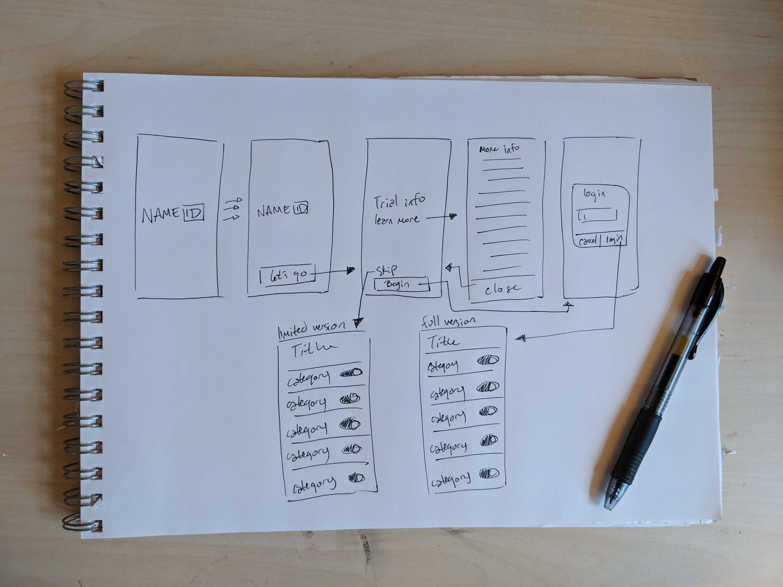
In order to begin this work, I did some research on what the out of box experience looks like in other places, such as physical unboxings and other first run experiences in apps and software set-ups. I found that the most important thing that the OOBE/ FRE does is educate the user while showing them the path with the least amount of resistance. I also learned that there were certain technical considerations that needed to be met, such as the end-user license agreement, a link for the user to be able to learn more about T-Mobile and the application, and obviously linked buttons to be able to move through the experience.
Once these absolute requirements were met, I started to think about how the layout should look to fit not only within the constraints of the screen but with the rest of the application. I started by doing an audit of the rest of the application for the layouts that were being used throughout. Because we were creating this application for mobile, elements from the native system were chosen for a smoother experience for users. This meant that for the most part, the framework was going to be tab based, with big center aligned buttons floating near the bottom of pages and the use of toggles as relevant to the overall experience.

I took these ideas to the lead designer of the product and we discussed the pros and cons of each version. He ended up liking the version with the copy and buttons better because it brought the user right to the point faster than the wizard which seemed like it would take an unnecessary amount of time to get through. After deciding which direction to go in, I started work on the visual design of the flow. I took the same route in visual design as I took in the user flow and started by doing research on the rest of the application and what other people were implementing in the same realm of experiences.
Because the color palette for T-Mobile is pretty rigid, I started by including flashes of magenta in the designs and incorporating the standard grey, black, and white color palettes elsewhere. In general, magenta is used as a guiding or active color so it is used sparingly. I found a placeholder image that I thought worked within the color palette and overall theming of T-Mobile’s brand and used it for the splash page, putting the NameID logo overtop it. I combined the visual style of T-Mobile with iOS and native fonts for a seamless experience for users and double checked that all the colors were ADA compliant. I wanted to make a couple versions to choose from that had similar look and feel so I made a dark theme and a light theme.

When I had my screens made, I sent them over to my lead for review, walking him through the flow and explaining my choices. When I walked the lead designer through my choices, we discussed the light and theme differences. He liked the dark theme however, the rest of the application is in the light theme so we decided to go with the light theme in the on-boarding experience to create more consistency in look and feel through the app.

Final thoughts
NameID was a great first introduction to the process that should be followed in a corporate environment and I think it was a good size project for my internship. It helped me build a solid foundation of knowledge to draw from when I was hired to work full time at T-Mobile and I learned about what an on-boarding process needs. I am satisfied that through this process, I built a good introduction flow to the application, helping usher in customers with an intuitive flow.